
Offline Room
离线之屋
Project
Offline Room responds to the theme of the studio, “Room with a view”.
Offline Room is an installation that studies an unconnected space and the relationships that this condition can create with the domestic space.
Today we are absorbed by the devices and our homes and our habits are modificated by the technology. The space-time perception is experienced through artificial mediations (tv, pc or phone have become the windows of the world), but what kind of future is expecting us? in the core of the room we develop a representation of a primordial future through a sensorial deprivation space.
什么是离线之屋?(项目简介)
离线之屋是为了诠释本次项目设计的主题“能看到风景的房间”而设计的。
离线之屋本身是一个装置,用于研究一种与外界无连接的空间以及在这种条件下会产生出的与内部空间之间的关系。
现如今我们整天围着各种各样的设备转来转去,我们的房子和生活习惯随着技术的发展而逐渐发生变化。甚至我们对时间和空间的感知都是通过人工调节设备(比如电视、电脑和电话已经成为了解世界的窗口)进行的,但是正在等待我们的是什么样的未来呢?本次房间设计的核心是通过一种感官剥夺的空间来表达出原始状况下的未来。

The room conceived as a box in the box consists of 5 spaces with different spatial configurations each associated with a specific device.
-Space of global sharing
-Space of unidirectional sharing
-Space of emotional dilation
-Space of gestural recognition
-Space of sensory deprivation
The most interior space consists of an area around the body that privileges the direct physical and spiritual relationship with oneself, representation of a primordial future in a sensorial deprivation space.
房间设想为盒子中套盒子的形式,总共由5个空间组成,每个空间都有不同的空间配置,都与特定的设备相关联。这五种空间分别是:
1.与全球信息联通的空间;2. 单向共享信息的空间;3.情绪膨胀的空间;4. 手势识别的空间;5. 感觉剥夺的空间
其中最内部的空间仅由身体周围的一小片区域构成,只能与自己形成直接的身体或精神上的连接,用于体现一种在感官剥夺的空间中以原始方式感知未来的情景。

Interview
Who influences you graphically?
The main influence of the technical drawings comes from the Atelier Bow Wow. They represent in their graphics everyday life situations, how people live in that moment in that space. Effectively, our intent was to draw the effect of human passage through the human spaces for giving quality to the role of architecture.
The others representations and collages are inspired by Viar Estudio, Point Supreme, Superstudio, Ettore Sottsass, Andrea Branzi, Giulio Paolini
访问环节
你们的作图风格是受到了谁的影响?
技术图纸的作图风格主要是受到日本犬吠工作室的影响。他们将日常生活中发生的点滴记录到图画中,大部分都是关于人们在某处空间的某个时刻里是怎么生活的。事实上,我们的意图是利用图画的方式,从空间使用的角度来记录人类活动产生的影响,从而让建筑发挥出更大的作用。
其他的表现方式和拼贴风图纸的表达则是从Viar Estudio、Point Supreme、Superstudio等事务所,埃托·索特萨斯、安德里亚·布兰兹以及朱利奥·保利尼等设计师身上汲取了灵感。
What defined the language of representation of the project?
It is very important to create an image of your project: the vision and the coordination of the works define your results. It was difficult to translate the contemporary scenario to a graphic synthesis but with the idea of personalizing the vision, we arrived at this result.
We want to denounce the present using the filter of blue + pink + technology + human behaviors; as Ugo La Pietra in “La casa telematica”. This kind of atmosphere brings the observer inside the critic/technological mood of the project.
In addition, the clarity of the boxes and their structure contributes to improve our representation language: we are referring to Sou Fujimoto’s idea of modular space and to the context of Archizoom in No stop city.
本次项目中,界定作品表达方式的语汇是什么?
表现语汇在在创作项目图纸中非常重要:作品的视觉表现力与和谐程度决定了你最终的结果如何。想要把现代化的场景用图形的方式转译出来确实比较困难,但是我们通过个性化的视觉图像成功地做到了这种转译。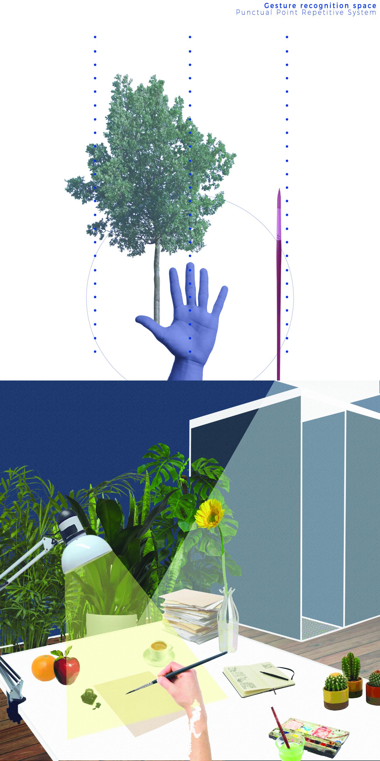
我们想要通过蓝色+粉色+技术+人类行为的滤镜效果对当下发生的某些现象提出质疑;正如艺术家Ugo La Pietra所说的“在家远程处理信息”,这种氛围把观察者带进了对项目的质疑或技术性情绪中。
此外,对箱子内情景和结构进行清晰的表达有助于提升我们的语汇表现力:因此我们借鉴了藤本壮介的模块化空间理念和阿基佐姆工作室设计的“无休止城市”方案。

What role does the colour blue play?
The blue colour is the key element for reading the project. As some marketing experts say, blue is a colour that can create addiction, in fact some social network as Facebook and twitter use the blue gradations for their graphics. For this reason, for us the blue represents the total addiction to the technologies today, that is the focus concept of the project.
蓝色在图纸中会发挥什么作用?
蓝色是解读该项目的关键因素。正如一些营销专家所说,蓝色能让人上瘾,事实上一些社交网络平台,比如脸谱网和推特,都运用了渐变的蓝色作为其图标。处于这样的原因,蓝色对我们来说代表了当今社会对技术的完全沉溺,这同时也是本次项目的核心概念。
Could you talk a bit more of how the design outcome in relation to your thesis? How important were the concept and material concept for the developing of the proposal?
The “box in box” concept is due to the creation of an imaginary path through the rooms that starts with the maximum of the technology and connection available and end without any kind of connection.
能具体说一说这些设计成果是怎样与你的主题关联起来的吗?概念和材料概念对方案的发展能发挥多大作用?
“套盒” 的概念简单而言是在房间中建立了一个假想的路径,从最外层与外界的技术和连接最多的空间逐层向内过渡,一直到最内层的房间里完全隔绝掉与外部的所有联系。
Each room is referred to the respective technological device and is a sort of barrier for the technological connections of the previous room. Decreasing of intensity, the smallest box is the core room. The climate in this room reminds to a primate condition, like a cave: the space is totally isolated, without connections and any kind of object, also the light is only natural. The exclusive presence is a person floating in a sensory deprivation water tub. This box is the real synthesis of the project: it expresses our idea of (primitive) future, a future that will delete objects to focus only on the humans.
每一个房间都各自配备有相关的技术设备,同时会对前一个房间的技术连接形成障碍。于是连接度逐层递减,最小的那个房间也是最核心的房间。这个房间的气候会使人联想到类似于洞穴一样的灵长类动物的生活环境:空间完全孤立,没有任何连接任何物体,只有光线照射进来。唯一的存在是一个人漂浮在没有任何感官信息来源的水缸里。这个套盒是这个项目的实景合成:它表达了我们对(原始状态下)未来的认知,这种未来中没有任何物体,只关注人类。
The concepts show the idea of the project: a sort of thematic shade guide the observer from the core room to the exterior through the devices. The material concept allows us to express directly the direction and the structure of the project: the space is defined only by the use of the users, so by the furniture and the technology.
这些概念展示了对本次项目的想法:以一种渐变的主题引导观察者通过技术设备从核心房间一步步过渡到外部。材质概念允许我们直接表达出项目的方向和结构:空间只有通过使用者的使用、家具和技术才能进行界定。
We map the materials for increasing the concept of boxes and their increment of “materiality”: to the decrease of technology (so with the increase of physical use of our five senses) correspond a more used space (visible by the “warmth” of materials).
我们将不同的材质拼贴进来用于强化各层盒子的概念以及它们的“物质性”:减少其技术性(相应的我们会增加对五感的依赖)来对应一处会被更多使用到的空间(例如通过“温暖”的材质使其具有可视性)。

What defined the various spaces, what do these specifically respond to? How does the box standardise each one?
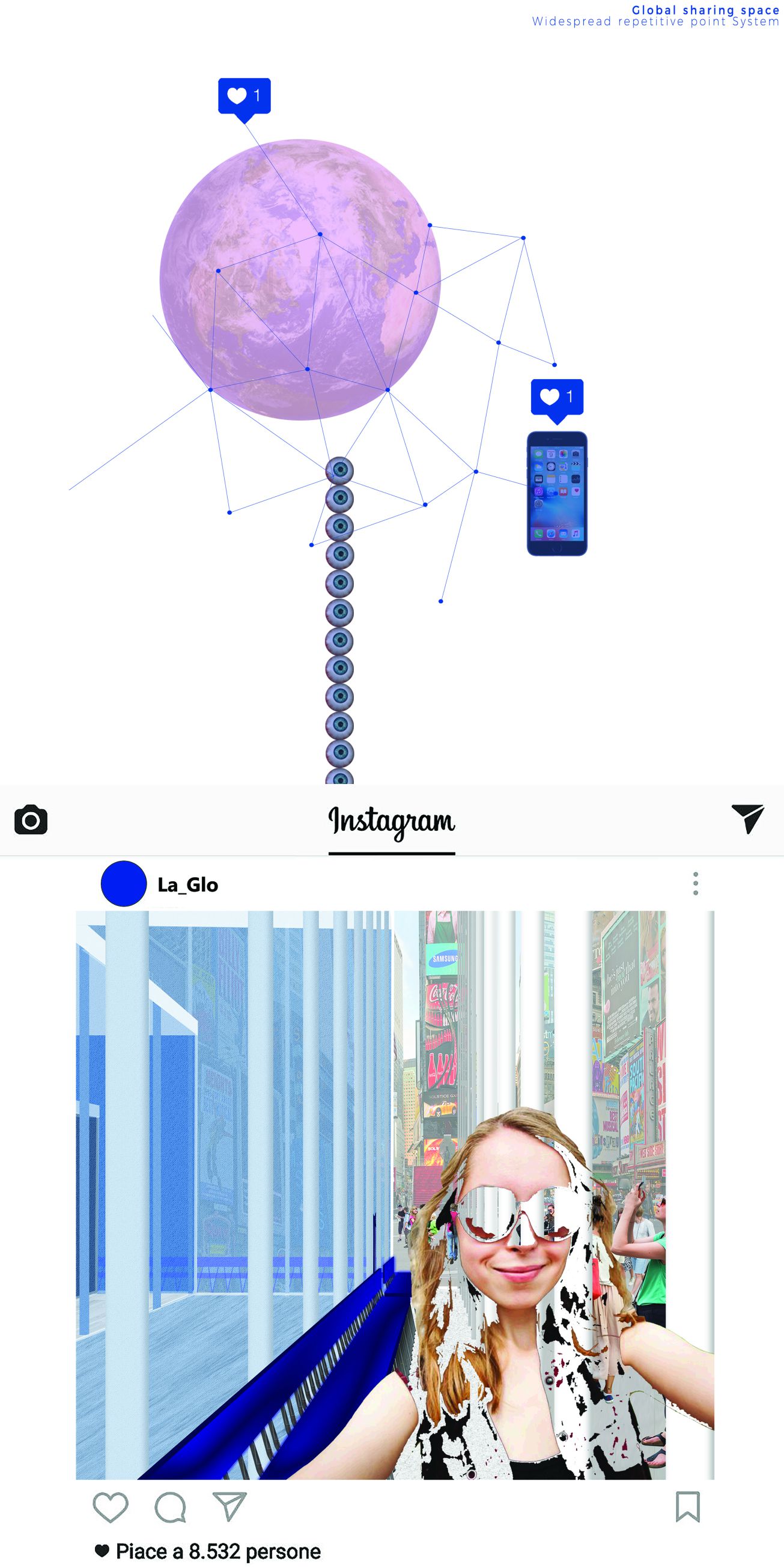
Each technological device generates a different spatial disposition for its fruition. For example, the technological device of the second box is the tv. The tv and the sofa with the carpet product a semicircular disposition that suggest a unidirectional sharing space. The others boxes follow the same logic, the first box (from the exterior) express the smartphone space: a global shared place with a multi-punctual diffused structure (this represent the behavior of people meanwhile using smartphones).
是什么界定出了不同的空间?这些界定条件具体又回应了什么?每个盒子又是如何统一标准的?
每一种技术设备根据其具体实现形式会产生不同的空间属性。例如,第二个盒子的技术装置是电视机。电视、地毯和沙发围合成半圆形,暗示出单向共享空间。其他的盒子也遵循同样的逻辑原则,第一个盒子(从外部开始)表达的是智能手机空间:通过多点散射式的结构暗示出其全球信息共享的属性(这种结构代表了人们使用智能手机时的行为)。
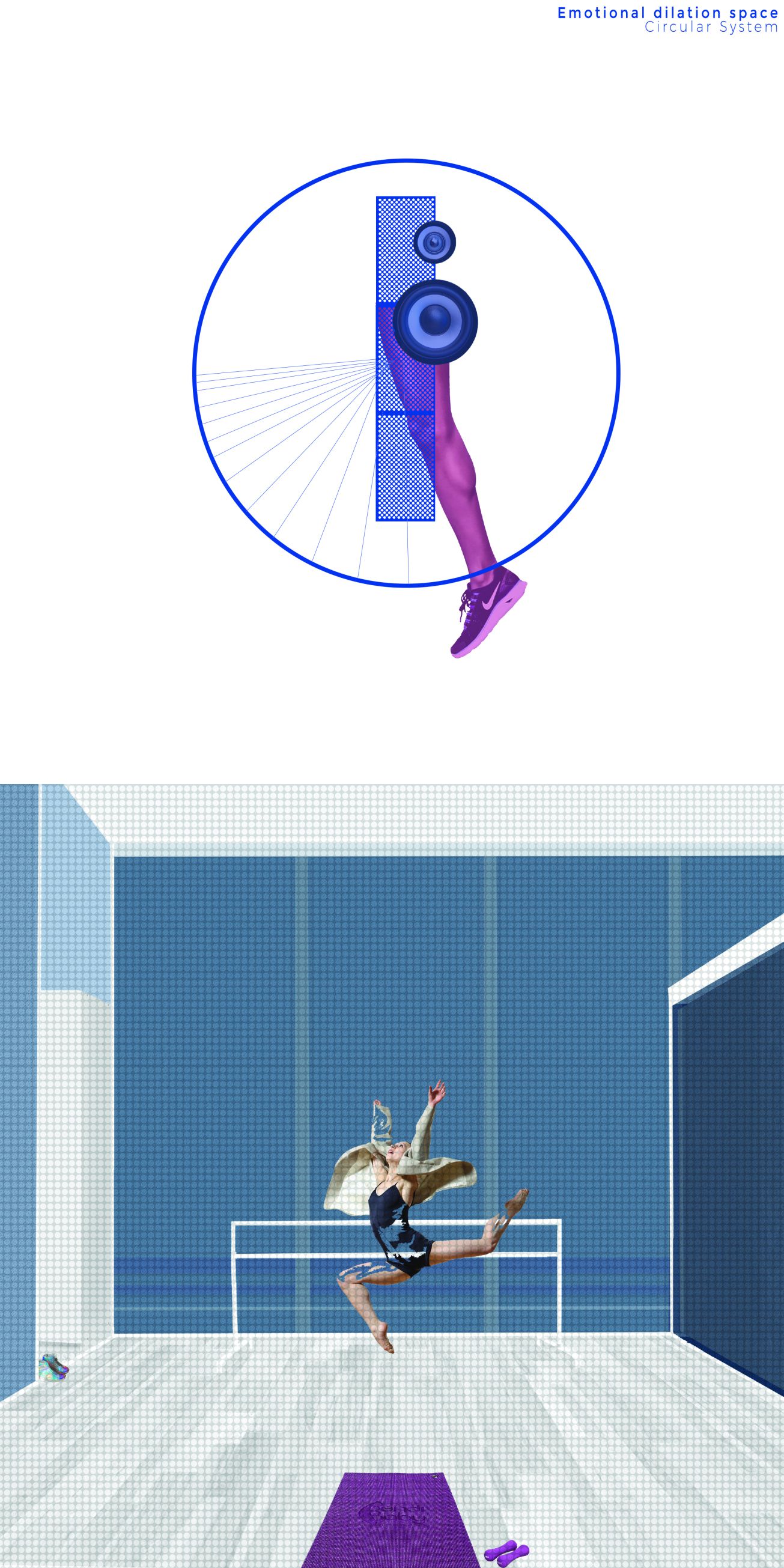
The third is radio-focused and express somewhat emotional: the free space is structural linked to a circle, so the physical movements play a fundamental role.
第三个盒子是以无线电为中心的,表达了某种情感:该自由空间从结构上与一个转动的圆柱相连接,暗示了物理运动所产生地基础性作用。
The next box is related only to the gestural recognition, so the space return to a punctiform structure but here is controlled and managed by the gestures of the person. The last box, the sensorial deprivation space, evidence the univocal punctual structure as a focus on the human condition.
下一个盒子中只能用手势进行信息识别,于是这处空间再次回到了与第一个盒子中相同的点状结构,只不过这里是由人的手势进行控制和管理的。最后一个盒子是感官剥夺空间,这里只有单一的时间概念,成为人类一切感知的焦点。

What is the role of furniture within these spaces?
The project is based on the concept that the furniture “create” the space. Actually, we can identify what kind of space is only by watching to its furniture (moreover, the number of furniture rises up as we reduce the intensity of technology). The technologies let us to live in an anonymous space, because the only important thing is the display and what’s inside; hence the proposed spaces are created only by objects, things that you can live with the specific technological device.
家具在这些空间中的作用是什么?
本次项目是基于家具“创造”空间的理念而形成的。事实上,我们仅仅通过观察家具就能辨别出某处空间的属性(此外,随着我们降低技术的强度,家具的数量也在增加)。这些技术让我们生活在一个匿名的空间中,因为唯一重要的东西是只有显示器和其传达的信息;因此,我们构思出来的空间只由实物创建出来,这些物体可以与特定的技术设备共存。


 下载手机APP
 关注微信公众号


回复 小乳猪: 看不懂就对了
我看不懂
有点难懂
就是文章有点长,细看感觉想法不错。5层空间,结合现代人的生活方式,智能、健身、自我,层层递进。
我看不懂